Using R Color Brewer
Making nice plots with good colours is easy using RColorBrewer. I put together a very simple tutorial walkthrough which you can see here.
I’m often asked how I make plot look nice for presentations and analysis. The answer is usually the same - start with nice colours! Thankfully this is made very easy if you use colours specified on the Color Brewer website. If you’re writing code in R there’s even a package which provides all of the colours for you called RColorBrewer.
To give some pointers to a colleague, I put together a quick demonstration explaining how to get started with RColorBrewer. This was done in R using knitr in RStudio to create nice HTML output. You can find the demonstration here. You can also find the original script here.
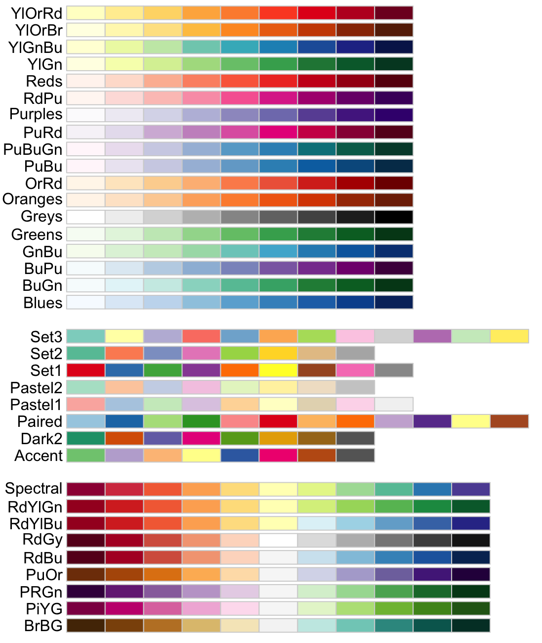
These are the Color Brewer palettes that you can find in the example:
